The Challenge: Convert abandoned cart recovery into an eCommerce marketing platform
Shortly after launching Jilt, SkyVerge (a fast-growing business with over 430 WooCommerce core contributions, 66 WooCommerce extensions, and over 100,000 customers) cofounders Max Rice and Justin Stern saw the possibility of developing it beyond a simple cart recovery platform. They recognized the potential of transforming it into a complete email marketing platform that could be customized to meet the unique needs of each client.
However, built by a team comprising backend and full-stack engineers, it lacked an attractive user interface and intuitive user experience.
The Solution: A partner to design and develop an attractive and functional UI
Jilt’s business goal was simple: Find a partner who could help build an engaging, user-friendly, and intuitive user interface to delight new users, retain existing customers, and reduce the number of support requests handled by the Jilt team.
Jilt was developed using Rails and React, and Stern wanted to use react_on_rails. Chatting with the creator of the react_on_rails gem, Justin Gordon, the CEO and Founder of ShakaCode and HiChee.com, gave Stern the confidence that Gordon understood Jilt’s needs and the challenges they faced. Moreover, as both were entrepreneurs, it felt like a good fit.
The ShakaCode team is super committed to both empowering their clients and giving back to the open-source community. They were an immediate and effective extension of our team. Our experience with them has been exceptional.

The Project: Increased value based on shared best practices
ShakaCode’s commitment to quality and best practices ensured that all code was peer-reviewed, with automated test procedures built-in. Moreover, each task was carefully tracked, and detailed reports provided each week. The process helped Stern ensure budgets were adhered to, milestones met, and issues addressed without delay. Continually improving processes helped ensure the project ran smoothly.
“ShakaCode did an awesome job when it came to recommending which technologies to use and setting them up for us,” states Stern. “We’ve been delighted, and so have our new team members. It’s quite something to have a potential employee ask what tech stack you’re using, and, when you tell them, their response is: ‘Good choice!’”
The Results: A cohesive, intuitive user interface for a great user experience
Targeting to go live a month or two after the project began, Stern believed the timeline to be too aggressive considering the size of the project. However, ShakaCode delivered on time even though the specs provided lacked detail in certain areas. Quickly adding more developers when needed was crucial to delivering on time.
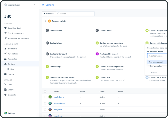
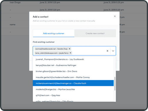
Jilt users now have a consistent look and feel across all screens, with much faster response times than previously when the application used server-side rendering. When combined with the attractive and intuitive UI, the increased performance has resulted in a significantly enhanced user experience. ShakaCode also developed several screens for new features—such as email list management and support for sending out newsletters. The overall impact has been reduced churn and increased retention. The number of support requests has also dropped significantly.
“We now have a fully functional, highly complex segmentation screen that delivers the functionality our users need,” states Stern. “It’s built with the best technologies, leverages best practices, and has established a pattern that we can consistently apply to the rest of the app. Now we can build and deploy fast, attractive, and user-friendly screens—something that we couldn’t do before.”
ShakaCode makes it happen!
Schedule a free, 30-minute call to discuss what ShakaCode can do for your project. Or email us at [email protected] with your ideas, challenges, or questions. We'll get back to you within two business days.

