GGet.com: Accelerating the uptake of coffee subscriptions

Status: Finished
Duration: 2020
Go to siteArrow right

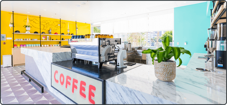
Founded in 2012 as a pop-up dedicated to creating innovative and memorable coffee experiences, Go Get Em Tiger (GGET) is a chain of bar-style, “community coffee” shops in Los Angeles, California. Renowned for exceptional service, awesome drinks, delicious food and pastries, the latest addition to GGET’s portfolio is a subscription-based, coffee club service with great coffee delivered right to customers’ homes.

The Challenge: Eliminate barriers to growth

Focused on driving more online business, GGET felt their subscription page was a barrier to growth. It wasn’t aligned to the customer journey in-store clients were used to, creating obstacles to ramping adoption. GGET wanted a simpler, more interactive user interface that would mirror the customer journey and enhance the user experience.

The Solution: Unleash creativity to enhance the customer journey

Already working with ShakaCode and creator of the to help develop the gget.com backend, introduce new features, and boost performance, GGET asked ShakaCode to redesign and develop the subscription landing page. The first thing ShakaCode’s design team did was evaluate the existing page to differentiate between what was working and what wasn’t.

What we found


A hero banner was missing, with simple text failing to grab the customer’s attention.
Expand

Graphics and colors were excellent, creating a warm, cozy feeling
Expand

Call-to-action buttons were creative but lacked a clear indication of what happens after you click the button.
Expand

The message for how the coffee club works was clear, but hidden amongst the ordering information. Many people miss it as they scroll.
Expand

The options for the type of coffee take up too much space. It isn’t easy to choose which one to purchase because you don’t see all of the selections within the same frame.
Expand

This layout works much better. It lets people know exactly how many cups of coffee they get based on the number of bags they purchase. It also tells them exactly how much they save by purchasing multiple bags.
Expand

The layout works, but forcing people to read text duplicated for each option isn’t user friendly.
Expand

The user interface (UI) is difficult to use. Every time you edit something, the screen scrolled, making it difficult to follow the purchase process.
Expand

The CTA lacks clarity. “Looks great” doesn’t tell you what happens when you click on the button.
Expand

The footer color matches that of the call-to-action buttons, reducing contrast and visibility for easy navigation.
Expand

The Project: Simplification = Amplification

After presenting the findings to management, GGET gave ShakaCode the go-ahead to design and build a new simplified landing page. The primary objectives were to reduce distractions by mirroring the customer journey, making it easy to start a subscription, and driving the adoption of subscriptions across GGET’s existing consumer base.
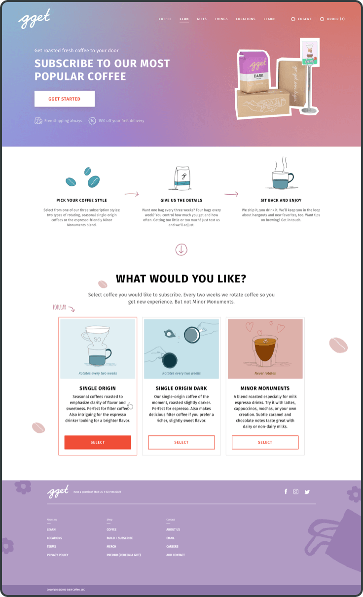

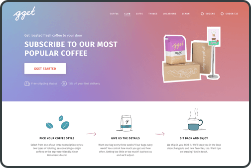
The hero banner tells people where they are, what they need to do, and their perks.
Expand

Explaining how the coffee club works is higher on the page, clearly outlining what customers need to know before they begin the purchase process.
Expand

It can be hard for first-time buyers to choose which selection to make, so we added a “Popular” choice label to make it easier.
Expand

Seeing all coffee flavor options simultaneously simplifies selection and accelerates the purchase process with a crystal clear call-to-action.
Expand

Once the customer selects the type of coffee they want, subscription options appear in a modal window. As a reusable element, the modal window can be activated from anywhere on the website to start the subscription process.
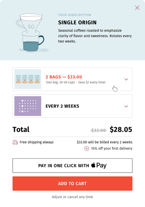

The subscription can be customized within one screen, with no scrolling required. Popular parameters are set by default, minimizing the clicks needed and making a one-click subscription possible.
Expand

All the necessary information to make a decision appears on a single screen.
Expand

The Benefit: Increased sales with an attractive, easy-to-use interface

ShakaCode redesigned and developed the coffee subscription webpage, simplifying the customer journey an enhancing the user experience. Streamlining development and reducing costs, ShakaCode used GGET’s existing style guide, ensuring the new pages are consistent in look and feel with the main website. Providing all the information they need to understand how the coffee club works, customers know exactly what to do to have great coffee delivered to their door.

The result?

Within six weeks of deployment, GGET’s subscriber-base increased by over 150%! (Ok, the COVID-19 lockdown may have played a small part in it, but we still think we did a great job—and so does GGET!)

ShakaCode makes it happen!

Schedule a free, 30-minute call to discuss what ShakaCode can do for your project. Or email us at [email protected] with your ideas, challenges, or questions. We'll get back to you within two business days.